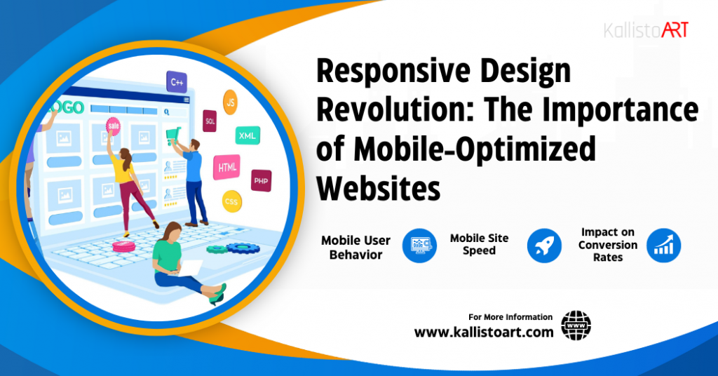
Best Website Design Tips You Can’t Ignore in 2024
 Welcome to our comprehensive guide on mastering website design in 2024! In today’s digital landscape, having an online presence is non-negotiable, and ensuring your website stands out is paramount. Whether you’re a burgeoning entrepreneur or a seasoned business owner, staying abreast of the latest web design trends is essential for success. In this article, we’ll delve into seven indispensable tips that will elevate your website to new heights. From responsive design to intuitive navigation, we’ll cover everything you need to know to captivate your audience and drive conversions. So, if you’re ready to take your online presence to the next level, let’s dive in! And for those seeking expert assistance, our web design company in Tampa is here to transform your digital dreams into reality.
Understanding User Experience (UX) Design
In the ever-evolving landscape of the internet, staying ahead in website design is crucial for businesses and individuals alike. As we step into 2024, the realm of web design continues to witness significant shifts and innovations. Whether you’re a seasoned designer or just starting your journey, embracing the latest trends and techniques is paramount to creating websites that captivate and engage users effectively. Understanding User Experience (UX) Design is pivotal in creating websites that not only look visually appealing but also provide seamless and intuitive interactions for users. UX design encompasses a broad spectrum of considerations aimed at enhancing the overall experience of visitors to a website. Here’s a deeper exploration of what it entails:
- User-Centric Approach: UX design revolves around putting users at the forefront of the design process. It involves understanding their needs, preferences, behaviors, and motivations to tailor the website experience accordingly.
- Intuitive Navigation: A key aspect of UX design is ensuring that users can navigate through the website effortlessly. This involves organizing content logically, implementing clear navigation menus, and providing intuitive pathways for users to find what they’re looking for.
- Accessibility: An inclusive approach to UX design involves making the website accessible to users of all abilities. This includes considerations such as providing alternative text for images, ensuring compatibility with screen readers, and designing with color contrast in mind.
- Responsive Design: With the proliferation of devices, UX design extends to ensuring that websites are responsive and adaptable to various screen sizes and resolutions. This ensures a consistent and optimal experience across desktops, laptops, tablets, and smartphones.
- Performance Optimization: UX design also encompasses optimizing website performance to ensure fast loading times and smooth interactions. Slow-loading pages or clunky interfaces can frustrate users and lead to high bounce rates.
Understanding UX design involves considering every aspect of the user’s interaction with a website and designing with their needs, preferences, and behaviors in mind. By prioritizing usability, accessibility, consistency, feedback, emotional engagement, performance, and cross-platform compatibility, designers can create exceptional user experiences that drive satisfaction, loyalty, and success.
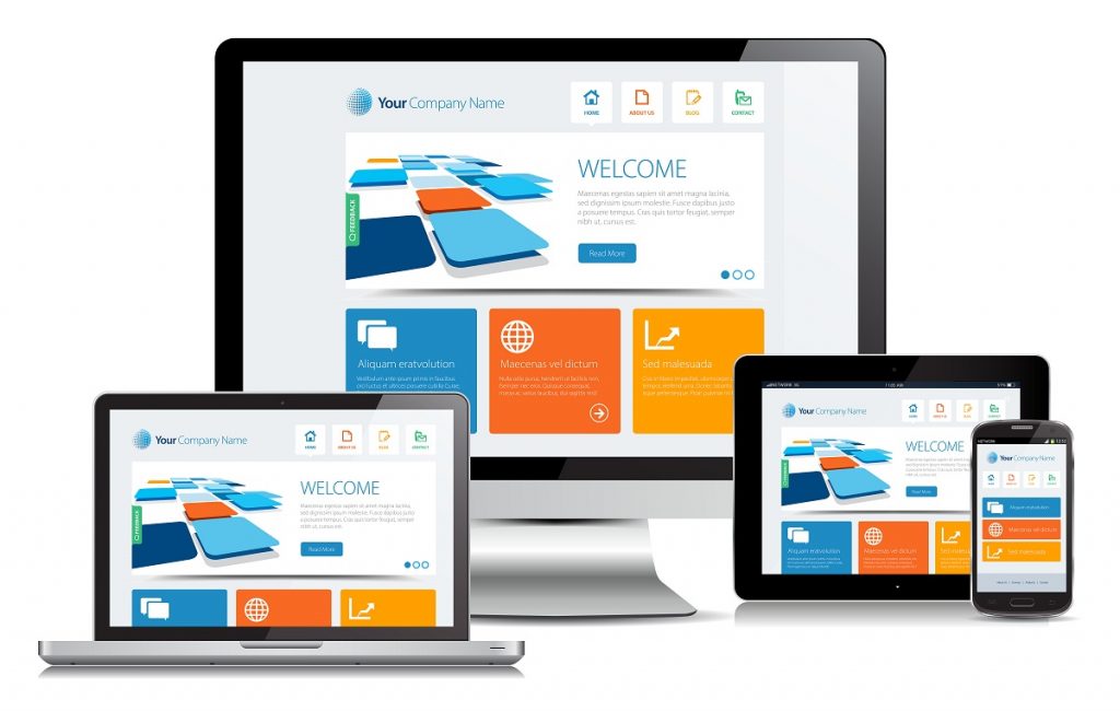
Responsive Design for Multi-Device Compatibility
Responsive Design for Multi-Device Compatibility refers to a design approach in website development aimed at ensuring that websites are accessible and user-friendly across a wide range of devices, including desktop computers, laptops, tablets, and smartphones. With the proliferation of various devices with different screen sizes, resolutions, and orientations, responsive design has become essential for providing a consistent and optimized user experience regardless of the device being used.
Responsive design achieves multi-device compatibility through several techniques:
- Fluid Grids: Instead of fixed-width layouts, responsive design uses fluid grids that adjust proportionally based on the screen size. This allows content to adapt dynamically, filling the available space on the screen without causing horizontal scrolling or distortion.
- Flexible Images: Images are scaled proportionally to fit the size of the screen while maintaining their aspect ratio. This ensures that images remain crisp and clear across different devices without being stretched or pixelated.
- Media Queries: Media queries are CSS rules that allow developers to apply different styles based on various factors such as screen width, resolution, and orientation. By using media queries, developers can create custom layouts and designs optimized for specific devices or screen sizes.
- Viewport Meta Tag: The viewport meta tag is used to control the layout and scaling of the web page on mobile devices. By setting the viewport width to match the device width, responsive design ensures that the website is displayed at the appropriate scale, eliminating the need for users to zoom in or out to view content.
- Flexible Content: In addition to images and grids, other content elements such as text, videos, and forms should also adapt gracefully to different screen sizes. Flexible typography and scalable icons are examples of techniques used to ensure that content remains readable and usable across devices.
By implementing responsive design principles, websites can provide a seamless and optimal user experience regardless of the device being used, thereby maximizing accessibility, usability, and engagement. This approach not only meets the diverse needs of users but also contributes to improved search engine rankings and overall brand reputation.
Optimization for Page Speed and Performance
Optimization for page speed and performance is a critical aspect of website design that focuses on ensuring that web pages load quickly and efficiently for users. In today’s digital landscape, where attention spans are short and competition is fierce, a website’s speed can significantly impact user experience, engagement, and ultimately, the success of a business or brand online.
There are several key components involved in optimizing page speed and performance:
- Reducing Server Response Time: This involves minimizing the time it takes for the web server to respond to a user’s request. Improvements in server infrastructure, efficient coding practices, and using content delivery networks (CDNs) can help reduce server response time.
- Minimizing HTTP Requests: Every element on a web page, such as images, scripts, and stylesheets, requires a separate HTTP request to the server. Minimizing the number of these requests by combining files, reducing unnecessary elements, and using CSS sprites can help improve page load times.
- Optimizing Images: Large, uncompressed images can significantly slow down page load times. Optimizing images by resizing them, compressing them, and using modern image formats such as WebP can help reduce file sizes without compromising quality.
- Enabling Browser Caching: Browser caching allows web browsers to store static resources locally, reducing the need to re-download them each time a user visits a page. Setting appropriate cache headers and leveraging browser caching directives can help improve page load times for returning visitors.
- Minimizing Render-Blocking Resources: CSS and JavaScript files that are render-blocking can delay the rendering of a web page, resulting in slower load times. Techniques such as asynchronous loading, deferred loading, and code splitting can help minimize the impact of render-blocking resources on page speed.
By implementing these optimization techniques and continually monitoring and fine-tuning performance metrics, website owners and designers can ensure that their sites deliver fast, seamless experiences for users, leading to higher engagement, improved conversion rates, and ultimately, greater success online.
Get the best mobile-friendly website today. Elevate your user experience and boost visibility. Let’s make your website shine on every device! Contact us now.
Importance of Content Strategy in Design
The “Importance of Content Strategy in Design” underscores the crucial relationship between the visual aspects of a website and the content it presents. It’s not enough for a website to look aesthetically pleasing; it must also effectively communicate the intended message to the audience. Here’s a deeper dive into why content strategy is integral to design:
- Alignment with Brand Identity: A well-defined content strategy ensures that the design elements of a website align seamlessly with the brand’s identity and messaging. From the choice of colors and fonts to the overall tone of voice, every aspect of design should reflect the brand’s personality and values.
- User Engagement and Retention: Compelling content keeps users engaged and encourages them to explore further. By integrating content strategy into design, websites can create a cohesive narrative that captivates visitors and encourages them to stay longer, reducing bounce rates and increasing retention.
- Clear Communication of Information: Design elements should enhance, not hinder, the communication of information. A thoughtfully crafted content strategy ensures that the layout, hierarchy, and presentation of content are optimized for clarity and comprehension. This is particularly important for websites that convey complex information or offer products and services requiring explanation.
- Call-to-Action (CTA) Effectiveness: CTAs are crucial for guiding users towards desired actions, whether it’s making a purchase, signing up for a newsletter, or downloading a resource. Effective design incorporates CTAs seamlessly into the content flow, making them prominent without being intrusive and ensuring they align with the user’s journey.
- SEO Optimization: Content strategy plays a significant role in search engine optimization (SEO). By strategically incorporating keywords, optimizing meta tags, and creating high-quality, relevant content, websites can improve their search engine rankings and attract organic traffic. Design should support these efforts by providing clear structures for content hierarchy and navigation.
In essence, the integration of content strategy into design is about more than just aesthetics; it’s about creating meaningful experiences that resonate with users and drive desired outcomes. By considering content needs from the outset of the design process and iterating collaboratively, designers can create websites that not only look beautiful but also deliver value to both the brand and its audience.
Voice User Interface (VUI) Integration for Hands-Free Interaction
Voice User Interface (VUI) Integration for Hands-Free Interaction refers to the incorporation of voice-activated technology into website design, allowing users to interact with the site using spoken commands rather than manual input via keyboard or mouse. This integration enables users to navigate through a website, perform actions, and access information without needing to touch the device or screen, making the interaction more convenient and accessible, especially in situations where hands-free operation is necessary or preferred.
Key aspects of VUI integration include:
- Understanding the Rise of Voice Search: With the increasing popularity of voice-activated virtual assistants like Siri, Google Assistant, and Alexa, users are increasingly relying on voice search to find information online. Website designers need to recognize this trend and optimize their sites for voice search queries to improve accessibility and user experience.
- Designing for Voice Commands and Responses: Websites need to be designed to understand and respond to natural language voice commands effectively. This involves implementing voice recognition technology that can accurately interpret spoken instructions and execute corresponding actions on the website.
- Ensuring Compatibility with Voice Assistants: Websites should also be compatible with popular voice assistant platforms to ensure seamless integration. This compatibility enables users to access website content and functionality through voice commands issued via their preferred voice assistant device or app.
Overall, integrating VUI into website design enhances user experience by providing a hands-free interaction method that is intuitive, efficient, and accessible to a wider range of users, including those with mobility impairments or who prefer spoken communication.
AI Integration for Personalized User Experiences
AI integration for personalized user experiences involves leveraging artificial intelligence technologies to tailor the content, features, and interactions of a website to meet the specific needs and preferences of individual users. This entails utilizing algorithms to analyze user behavior, preferences, and past interactions with the website, enabling the system to deliver customized recommendations, content suggestions, and user interfaces. Through AI-driven personalization, websites can dynamically adjust their content presentation, layout, and functionality in real-time, providing users with a more relevant and engaging experience. Whether it’s through personalized product recommendations, adaptive interfaces, or intelligent chatbots, AI integration enhances user satisfaction, increases engagement, and ultimately drives conversions.
Conclusion
Frequently Asked Questions
Q1. What is responsive design, and why is it important?
Ans: Responsive design ensures that your website adapts seamlessly to various screen sizes and devices, providing an optimal viewing experience for users. It’s essential in 2024 due to the increasing use of mobile devices for browsing the internet.
Q2. How can I optimize my website’s performance?
Ans: Optimizing performance involves various techniques such as efficient coding, image and video optimization, and leveraging caching mechanisms. These measures help improve page loading speed, which is critical for user satisfaction and search engine rankings.
Q3. Why is accessibility compliance necessary for my website? .
Ans: Accessibility compliance ensures that your website is usable by individuals of all abilities. Adhering to WCAG standards ensures that features like alt text for images and keyboard navigation are implemented, making your website inclusive and accessible to everyone.
Q4. What is dark mode compatibility, and should I implement it on my website?
Ans: Dark mode compatibility involves offering a dark theme option for users who prefer it. It enhances user comfort in low-light environments and adds a modern touch to your design, making it a valuable addition to consider in 2024.
Q5. How can interactive elements benefit my website?
Ans: Interactive elements such as animations, sliders, and micro-interactions engage users and enhance their overall experience on your website. They improve user engagement, making your website more dynamic and visually appealing.